Tuesday, February 23, 2010

Part 2: The Booth.

After noticing your lovely retractile banner, your perspective client will probably mosey on over to your booth. Now is when we get to the meat and potatoes; your booth display.

You have many options here. You could get a large background and podium:


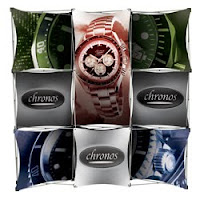
Or how about one of my personal favorites, the mosaic display. This one is easily set up and taken down, is very transportable and very eye catching.


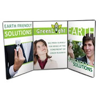
You can also use the 3 angle display. It's a very simple and effective way to get your message across:
Here I have only listed 3 of many, many options. These are all great options. You can call the experts here and we can discuss which one will best showcase your business.

Thursday, February 18, 2010

Convention Checklist Part 1/5 - Banners

Today begins our five part series on convention planning and materials. I will talk about what you need in terms of marketing materials to get the attention you want from the attendees. And I will give you ideas that will help you achieve top-of-mind awareness. Heed my advice and you will get more new clients from every trade show that you do.

Let's get started by talking about the piece that is usually the largest and will help attract attention to your booth or table; the banner. Too many booth jockeys (just coined it) over look the importance of having a sign at eye level. Convention attendees walk by hundreds of smiling faces. (Don't get me wrong, having a smiling face is important.) However, you will not stand out if you simply sit there smiling. You must to have some signage. Take, for example, the United banner.


A few points about our banner;
-Vibrant colors that meet our branding guidelines.
-Taller than the average person, so that people can see the banner, even if they are in a crowd.
-LARGE lettering so people can read it from almost any distance.
-Convenient and east to open, close, carry around, and store.
-Comes with its own carrying bag, and the entire package is actually very light.

Although our banner just has our logo, many companies find it useful to have their banners display some of their products and services.

There are so many types of banners out there; we can always help you find the right banner for you. I think that the retractable banner is perfect for busy convention booth jockeys because it looks great, it's light, and it's easy to set up.

Stay tuned for Part 2 of our series, coming next week!

Friday, February 12, 2010

My new favorite promo.

This is it everyone! We can finally stop thinking of new and innovative marketing specialties because we will never surpass this:

The Can Grip:


I freaking love this thing. I use it at every opportunity. I believe the tagline goes something like: Adding class to the 12 oz. can. Screen printed on the outside of the handle with a 1 color imprint; Imagine getting one of these badboys when you step into your favorite bar. Or how about the bonding that will occur when you can easily spot your frat brother from across the keg party because the hand that is not fist-pumping is clutching the same "TKE" (or whichever combination of roman numerals) Can Grip as you are?! I see high-fives in the near future, maybe even a little bromance.

Are you trying to reach the beer or soda can drinking market? Oh, you mean nearly everyone? This is the perfect item...

Come to think of it actually; don't stop coming up with new items yet... I will need one of these for bottles too.

Wednesday, January 6, 2010

Vegas Convention

Next week is the industry's big, big show in fabulous Las Vegas!! I will be there all week, and I will be thinking of you, my reader, as I go from aisle to aisle, finding the best, coolest, funnest, greenest, newest, and most unique items for me to blog about and for you to read about.

Looking for a special promotion this year? Do you have great marketing ideas swirling about in your brain, but you're not sure how to execute? Does your company only buy promotions that are forest-green in color? Now is the perfect time for us to talk! Drop me a line, comment, or email and I will be sure to bring you back some awesome samples that will tie your marketing campaign together like magic!

Let's start oh10 off the right way... By going to Vegas. Umm, that is, by going to Vegas and owning this convention!

Tuesday, November 10, 2009

Cube

No, not that ridiculous movie from 1997 (or its equally ridiculous sequel, Hypercube), but the cube that sits on your desk and is useful for months. The Post-it Note cube.

If you were fortunate enough this year to obtain one of our showcase goodie bags, you have already seen United's Post-it Cube. This is definitely one of my favorite self promotions.


You might recognize this art from our last self promo. But since there is only one cost to have unique art on all 4 sides of the cube, we decided to go a different direction for the art on the other side.

Check out the other 2 sides on our Web Photo Album. This is such a splendid promotion because the art just looks great, and you are also able to keep your companies name in front of your prospects for months and months. Look in the album, and you will see that we put contact info at the very bottom of the art. We did this so that even if the Notepad gets very low, our clients and prospects still have our contact info right in front of them.

Check our store for all types of different styles.

Monday, November 2, 2009

Just Kick the Extra Point

The Jets lost to their long time rivals the Miami Dolphins yesterday, 25 - 30. Some Say that head coach Rex Ryan should have decided to kick the extra points instead of 3 failed 2-point conversion attempts. I say I got my 'extra points' when, on my way out of the game, they handed me a sweet mug.

Wow, thanks! AND I get to take it to Jets' sponsor "Hess" gas station and get a free coffee any time after the game. How sweet is that? I love coffee.

The mug is a nice keepsake. It not only comes with the opportunity to get a free coffee, but it also features 6 Jets on the on the outside in action photos; Leon Washington, Darrelle Revis, Kerry Rhodes, Jerricho Cotchery, Dustin Keller, and Kris Jenkins.


You can see in this pic that the art on the mug is actually a piece of paper that they print and then cut out to stick in-between the inside and clear outside of the mug. It really gives the mug a nice look and enables all sorts of design work to be done. This art is actually 4 color process ( Cyan, Magenta, Yellow, and Black combined in various amounts to make up almost all other possible colors) plus 1 spot color, the Green in the Jets logo. You have to admire a team that will pay a little extra and stick with their branding guidelines to make sure the Jets Green is always the same green. Love it, this is what branding is all about.

On the Jets' wiki, it says the color is 'Hunter Green' I couldn't find the Pantone number of the color, this is probably to prevent people from creating accurate knock off merchandise. (which happens aplenty anyway).

Check the Picasa album for more pics of the Tumbler. Including the Official NFL hologram sticker and action shots of yours-truly drinking my coffee and feeling like I'm part of the Gang Green.

Monday, October 26, 2009

Curbside Handouts

I'm not sure which comedian it was who said that 'the guy on the corner handing out fliers might as well be saying; "Here, can you throw this out for me" as he hands you the post card'. This is pretty hilarious, but it's not always true. A little while ago, I got a card from John Allan's. From the looks of the card, the place must be a spa or health club. Or at the very least an up-scale barber.

Upon closer inspection, the picture on the front shows a pool table in the foreground, and a bunch of men getting their hair cut in the background. Seems like a good place to go to get my hair did. Below the picture, they offer a nice coupon. The kicker to this handout, though, is the free sample of shampoo that is stapled to the top corner. How clever. Most people will toss a postcard without giving it a second look, but if there is a free sample attached, well, this one is a keeper.

The little pouch of shampoo is branded with the barber shop's logo and colors. This must have been a custom job. To get the shop's own shampoo in these little pouches is really impressive. This must have been a national campaign (they have 1 location in Chicago and 4 in NYC).

You can see that the integration of printing and promotional products can make a big splash. Just like our Awesome-vitiation, which combined the 2 items, it is not only a memorable gift that the potential client receives, but also a postcard full of valuable info. This combined with direct mailing is sure to bring in clients and spur up some curiosity about any business.

Play pool while you wait!